
Why Illustrated City Posters Beat Photography Prints
- Poster Shop Boys
- Jul 2
- 6 min read
Updated: 3 days ago

There's a photograph of Tower Bridge on roughly four million living room walls across the United Kingdom. You've seen it. Grey sky, long exposure, the Thames doing its Thames thing. It's competent. It's inoffensive. It commits the cardinal sin of wall art: it makes absolutely no statement whatsoever.
Then there's illustration. Bold lines, considered colour, a point of view baked into every decision the artist made. An illustrated city travel poster UK doesn't just show you a place — it tells you something about it. It has swagger. It has an era. It has the kind of visual confidence that a stock photograph, however technically accomplished, simply cannot manufacture.
This isn't snobbery. It's design literacy. And once you understand the difference, you'll never look at a photography print the same way again.
The Problem With Photography Prints
Let's be honest about what a photography print actually is. It's a moment. A specific Tuesday afternoon in whatever year, captured by whoever was standing there with a camera that cost more than your first car. The light might be beautiful. The composition might be precise. But the image belongs to that photographer's afternoon, not to your living room wall in 2025.
Photography prints are also, by their nature, infinitely reproducible without any degradation of meaning. The same photograph of the Eiffel Tower sparkles identically whether it's hanging in a Parisian boutique hotel or printed onto a £4 canvas in a discount homewares chain. There's no hierarchy of quality in the image itself — only in the print. The image has no skin in the game.
Illustration, by contrast, is an authored object. Every illustrated city travel poster begins with a human being making thousands of micro-decisions: which elements of the city to include, which to omit, what colour palette captures the emotional temperature of the place, what typographic choices give it the right period energy. Those decisions are irreversible and intentional. The result is something that could only exist as that specific piece of art.
And practically speaking, photography prints age in a way that illustration doesn't. The documentary realism that makes a photograph feel powerful in the moment is also what makes it feel dated a decade later. An illustration of Tower Bridge from the golden age of travel poster design looks as relevant today as it did when the style was invented — because it was never trying to be a record of time. It was always trying to be something more enduring than that.
What Illustration Actually Does to a Room
Wall art has one job: to change the energy of a space. Not decorate it — change it. There's a meaningful difference. Decoration fills a gap. Art shifts the entire register of a room, the way a single piece of well-chosen furniture can redefine what a space feels like to be inside.
Illustrated city travel posters do this with particular force because they operate on multiple levels simultaneously. There's the immediate visual impact — bold graphic shapes, strong colour fields, clean lines that hold their own from across the room. But there's also the cultural layer. A well-executed illustrated city poster carries the DNA of mid-century graphic design, of the golden age of rail and air travel, of an era when the world felt like it was being discovered for the first time and artists were hired to make that discovery look irresistible.
That layered reading is what makes illustration so much more interesting to live with than photography. A photograph gives you everything at once. An illustration reveals itself gradually — the detail in the linework, the wit in the composition, the unexpected colour choice that shouldn't work but absolutely does. You stop noticing a photograph within a fortnight. You keep noticing a great illustration for years.
In practical terms, illustrated posters are also far easier to style into an interior. The limited, considered colour palettes of good illustration make it possible to build a room's whole colour story around a single print. Our Tower Bridge illustration, for example, works as a genuine anchor piece — it has enough visual authority to hold a gallery wall together without overwhelming everything around it, and its palette is specific enough to give you a real direction to work with.
The Travel Poster Tradition Is Worth Understanding
The illustrated city travel poster has a lineage that photography simply doesn't. From the railway poster boom of the 1920s and 30s to the golden age of BOAC and Pan Am in the 50s and 60s, illustrated travel posters were the premium advertising medium of their time. Brands spent serious money commissioning serious artists to produce work that would make people dream about destinations.
The artists who defined the form — A.M. Cassandre, Tom Purvis, the anonymous geniuses who produced those extraordinary London Transport posters — understood that their job wasn't to document a place but to distil it. To find the single image, the single mood, the single colour story that would make someone sitting in a grey November office want to be somewhere else entirely. That's an incredibly sophisticated design problem, and the best illustrated city travel posters solved it with an economy and elegance that's never been bettered.
When you buy an illustrated city travel poster in the UK today, you're not just buying a piece of wall art. You're buying into that tradition. You're aligning your space with a visual culture that has genuine depth and history. That's not something any travel photograph, however dramatic, can offer you.
How to Build a Gallery Wall Around Illustrated City Poster
Gallery walls live or die by internal logic. The most common mistake people make is treating them as a collection of individual pictures rather than a single composed piece. When you're working with illustrated city travel posters, you have a significant advantage: the graphic design tradition they come from has built-in visual rules that make them naturally cohesive.
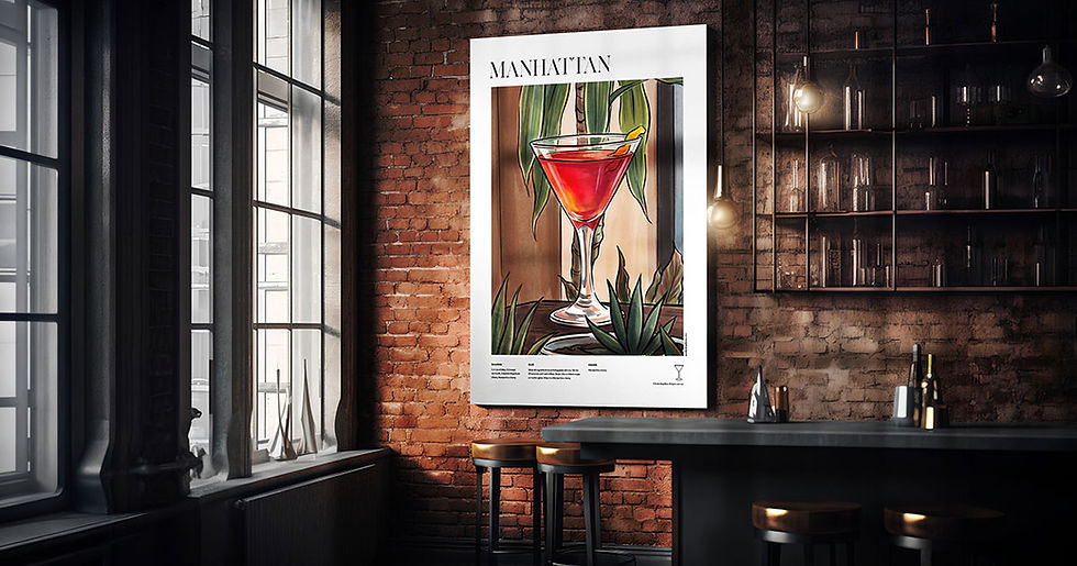
Start with your anchor piece — the largest print, the one with the most visual weight. From there, build outward with prints that share at least one design characteristic: a common colour in the palette, a similar typographic register, or a consistent illustration style. Mixing our illustrated city prints with other PSB work — say, pairing a city travel poster with one of our iconic cocktail prints like the Negroni poster — works surprisingly well because both series share the same mid-century graphic sensibility. The Negroni print has that same confident flat-colour illustration approach, so the visual language is consistent even though the subject matter shifts completely.
Frame consistently, or don't frame at all. Matching thin black frames create a clean, editorial feel that suits the graphic nature of illustrated posters. If you're going unframed, lean into it — posters are posters, and there's a whole design tradition of bold prints pinned or mounted simply that has its own distinct character.
Spacing matters more than people think. Tight groupings feel deliberate and urban. Wider spacing feels more considered and gallery-like. Neither is wrong, but pick one approach and commit to it. The worst gallery walls are the ones that can't decide what they are.
Why PSB Illustration Has a Point of View
A lot of illustrated posters on the market right now are technically competent and aesthetically null. They've been designed by algorithm or by committee to appeal to the broadest possible audience, which means they end up appealing, genuinely and deeply, to nobody. They sit on walls, and they do nothing.
Poster Shop Boys prints are made with a specific visual vocabulary in mind. The mid-century graphic tradition — flat colour, strong line, confident composition, typography that means something — runs through everything we make. Whether it's our Tower Bridge illustration or our Jules Winnfield print, the design DNA is consistent. That's not an accident. It's the result of having actual opinions about what good illustration looks like.
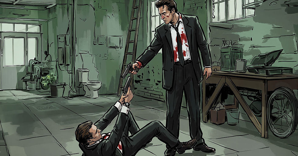
The Jules Winnfield print is worth mentioning specifically because it illustrates the point well. A photographic still from Pulp Fiction would be just another movie print. An illustrated version with that same mid-century travel poster energy transforms the subject matter entirely — it places a piece of cinema culture inside a graphic tradition, and the collision between the two is what makes it interesting. That kind of curatorial thinking is what separates a poster shop with a point of view from one that's just printing things people might vaguely recognise.
When you're choosing an illustrated city travel poster for your UK home, the question worth asking isn't just which city — it's which design sensibility. Because the illustration style is carrying as much meaning as the subject matter. Choose work that knows what it is.
Browse the Collection
If you're ready to put something on your walls that actually earns its place there, start with our Cities & Travel range — illustration with the confidence to change a room.
Illustrated City Travel Poster UK | Graphic Travel Poster Art | Mid-Century Wall Prints | Cities And Travel Posters | Gallery Wall Ideas | Original Illustrated Posters

Comments