
The Brief Used to Be: Make Something Worth Looking At
- Poster Shop Boys
- Jul 3
- 6 min read
Updated: 3 days ago

There is a version of this argument that gets made loudly and badly all the time — usually by someone on a design forum who owns too many vintage prints and not enough self-awareness. The complaint about modern movie posters has become its own cliché: floating heads, orange and teal, the same actor photographed from three slightly different angles arranged into a collage that says absolutely nothing. We've heard it. The point stands. But the more interesting question isn't what went wrong with movie posters. It's what was actually right about them when they were good — and whether that thing can survive outside of a cinema lobby.
When the Brief Was 'Make Something Worth Looking At'
The commercial imperative behind a movie poster has never changed. Its job is to sell tickets. What changed, somewhere in the late 1980s and accelerating rapidly through the 1990s, was who was trusted to do that job. For most of cinema's first century, the answer was illustrators — artists who were given a film, a concept, and the creative latitude to translate it into something that worked as a standalone image. The result wasn't always high art. It was often lurid, sometimes misleading, occasionally bizarre. But it was always made.
Take the original poster work for Alien. The tagline — 'In space, no one can hear you scream' — is one of the most enduring lines in cinema history. But the image it was paired with did something the line alone couldn't: it created dread through abstraction. An egg. A crack. A light. The horror was implied, not illustrated literally, and that restraint required an artistic decision, not a a digital compositing trick. That kind of thinking — what do we leave out, what do we suggest, what does the viewer's imagination do with the rest — is the province of illustration. It cannot be automated.
The illustrated movie poster in the UK had its own distinct tradition, too, shaped partly by the country's long history of graphic design and commercial art, and partly by the particular sensibility British audiences brought to cinema. Posters here tended toward the composed rather than the bombastic. Not always. But the craft tradition ran deep.
The Exact Moment It All Changed (And Why It Was Money, Obviously)
Digital tools didn't kill the illustrated movie poster by being better. They killed it by being faster and cheaper and, crucially, by making it possible to incorporate actual photographic likenesses of the stars — which studios increasingly demanded as contractual obligations became more stringent. By the mid-1990s, major talent agencies were writing poster approval clauses into deals. The actor had to be recognisable. The actor had to be flattering. The actor, frankly, had to look like the actor. Illustration, by its nature, interprets. It edits. It makes choices about what matters. That creative license became legally inconvenient.
The knock-on effect was the homogenisation that everyone now complains about. When your poster must show the star's face accurately, must be assembled quickly, and must be approved by four different departments and two talent representatives, you end up with the floating heads. Every time. Not because designers are lazy or talentless — many of the people doing this work are extremely skilled — but because the constraints don't leave room for anything else. The brief became 'don't get us sued and have it done by Thursday.'
What's genuinely surprising is how long it took for the cultural pendulum to swing back. The appetite for illustrated work in cinema culture never actually disappeared — it went underground, into the alternative poster movement that exploded through the 2000s and 2010s, with artists producing unofficial prints for films that the studios' own marketing departments had comprehensively failed. The demand was always there. The studios just weren't meeting it.
What Illustration Does That Photography Can't
Here is the sharpest way to put it: a photograph of a film documents it. An illustration interprets it. These are not the same thing, and the difference matters enormously when you're deciding what to put on your wall.
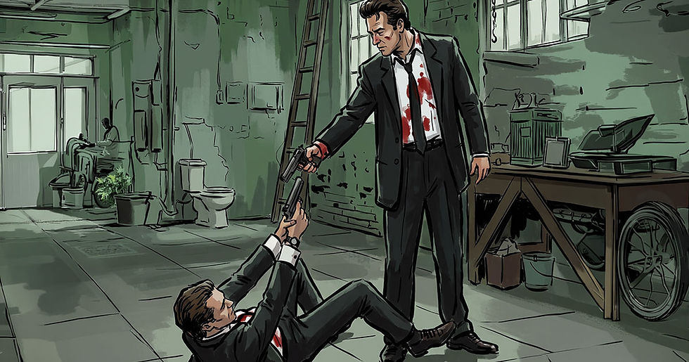
A photograph of Jules Winnfield is a photograph of Samuel L. Jackson on a set in Los Angeles in 1993. An illustrated version of Jules Winnfield is a distillation of everything that character means — the controlled menace, the monologue cadence, the specific geometry of the haircut, the gun held with casual authority. The illustrator decides what to emphasise. They edit out everything that doesn't serve the idea. The result is an image that carries the weight of the character rather than the record of a production. This is why PSB's Jules Winnfield poster works as a piece of wall art in a way that a film still never could — it's been thought about, not just captured.
This interpretive quality is also why illustrated movie posters age so differently to photographic ones. The great illustrated posters from cinema's mid-century hold up not because they're nostalgic but because the thinking behind them was durable. An image built on ideas rather than documentation doesn't date the same way. The colour palette might place it in time. The typography certainly will. But the underlying concept — if it was a good one — stays alive.
The UK's Particular Relationship With Cinema on the Wall
Britain has always had a slightly different relationship with movie culture than America. The reverence for cinema here tends to be quieter, more curatorial. The films that get placed on walls in UK homes — in living rooms, in studies, in the kind of kitchen that also somehow has a decent vinyl collection — tend to be the ones that meant something, not just the ones that made money. Pulp Fiction. Fight Club. The Good The Bad and The Ugly. Heat. Fargo. Parasite. These aren't chosen because they were the biggest films of their year. They're chosen because they have a specific visual identity, a distinctive world, a feeling that persists.
The illustrated movie poster fits this sensibility precisely because it's a considered object. You don't put an illustrated poster on your wall accidentally. You put it there because you made a choice — about the film, about the image, about what that combination says in the context of your home. There's a reason the demand for quality illustrated movie poster art in the UK has grown steadily while the mainstream poster industry has continued its decline into mediocrity. The audience for genuine work has always existed. They were just waiting for someone to make it.
It's also worth noting that the UK's design culture — specifically its tradition of editorial illustration, its art school heritage, its comfort with visual wit and formal experimentation — makes it a particularly fertile environment for this kind of work. The illustrated poster has good soil here.
Why the Best Posters Were Never Really About the Film
This sounds counterintuitive, but follow it through. The best illustrated movie posters — the ones that endure, the ones that become genuinely iconic — succeed because they transcend the film and become images in their own right. The original artwork for The Graduate isn't primarily interesting because it tells you what The Graduate is about. It's interesting because of the composition, the implied relationship, the specific shade of unease it generates. The film earns the poster. But the poster stands alone.
This is what separates a poster worth owning from a poster worth glancing at in a cinema lobby. The former has been designed to live beyond its commercial moment. The latter was designed to drive opening weekend numbers and then quietly disappear. When illustration is done with genuine craft and a clear point of view — when the artist has made real decisions about colour, line, tone, hierarchy — the result is something with a lifespan measured in decades rather than weeks. That's not nostalgia. That's just the difference between work that was made to last and work that was made to function.
The Darth Vader poster, the Tyler Durden, the Neil McCauley — these images work on a wall in 2025 because someone made choices that were right and durable, not just expedient. That's the argument for illustration. That's always been the argument for illustration.
Browse the Collection
If this piece has made you want to look at what a properly illustrated movie poster can do, see for yourself — PSB's movie collection spans Pulp Fiction and Fight Club to Heat, Fargo, Parasite and beyond, each one made to live on a wall rather than sell a ticket. Hang something worth looking at!

Comments