
The Importance of Paper Quality in Poster Art
- Poster Shop Boys
- Jun 19
- 5 min read
Updated: 3 days ago
Why Paper Matters
Nobody talks about paper. When people buy a poster, they focus on the image. They consider the composition, the colours, and the subject. They read the description, look at mockup images, and decide they like it. Then, they click buy. The paper it is printed on often becomes an afterthought — if it is considered at all.
This is completely understandable. Yet, it is a mistake. Two posters of the same image, printed on different paper stocks, can look completely different. The colours can shift. The contrast can flatten. The feeling of quality — or the lack of it — is communicated the moment someone picks it up and holds it.
The paper is not just a technical detail. It is the material reality of what you are buying.
What 200gsm Actually Means
GSM stands for grams per square metre. It is the standard measure of paper weight and density. The higher the number, the heavier and thicker the paper.
Standard office printer paper is typically 80gsm. This is the paper you feed into a home printer. It buckles slightly when you write on it with a heavy pen and becomes translucent when held up to light. That is 80gsm.
Cheap poster prints — the kind that come rolled in a cardboard tube from budget online stores — are typically 130-150gsm. While heavier than printer paper, they feel insubstantial when you hold them. They develop micro-creases when unrolled and never quite lie flat.
In contrast, Poster Shop Boys prints on 200gsm premium art paper. At 200gsm, the paper has real weight. It does not flex when you hold it from one corner. It does not develop creases during transit. When you take it out of the packaging and hold it up, it communicates quality before you have even properly looked at the image.
Two hundred grams per square metre is the weight at which a poster stops feeling like a poster and starts feeling like an art print. That distinction matters more than most people realise until they experience it.
The Matte Finish Question
There are two primary finish options for art prints: matte and gloss. The debate between them is older than digital printing and shows no signs of resolution. Here is our position, and the reasoning behind it.
Gloss looks impressive in a shop. Under controlled lighting, against a dark background, a glossy print has a vivid, saturated quality that catches the eye. This is why most point-of-sale poster displays use gloss — it performs well in retail environments.
However, in a home, on a wall, under the varied and uncontrollable lighting of actual life, gloss can be a liability. It reflects. Every light source in the room — the window, the overhead light, the lamp — creates a glare spot on the print that moves as you move. The image becomes partially obscured by reflections of the room it is hanging in.
Matte finish eliminates this issue. Light is absorbed rather than reflected. The image remains consistent from every viewing angle. You can see the whole poster from across the room and up close without the light fighting you.
There is also a tactile dimension. Matte paper has a slight texture — a tooth, to use the printing term — that makes it feel substantial and considered. Gloss is smooth and slightly slippery in a way that can feel cheap despite its vivid appearance.
Every print in the Poster Shop Boys collection uses a smooth matte finish. This choice is not because it is cheaper or easier. It is because it looks better in actual homes under actual conditions.
How Paper Quality Affects Illustrated Art
Photography can survive on poor paper better than illustration. A photograph has its own internal complexity — the gradations of light and shadow, the depth of field, the grain — that carries the image regardless of the substrate it is printed on.
Illustration is different. Illustrated art depends on the paper to carry colour, hold detail, and communicate the quality of the original work. On poor paper, illustrated colours look flat and slightly dingy. The bold graphic qualities that make illustrated art compelling — the strong outlines, the saturated colour blocks, the crisp typography — become muddier and less defined.
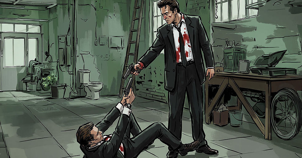
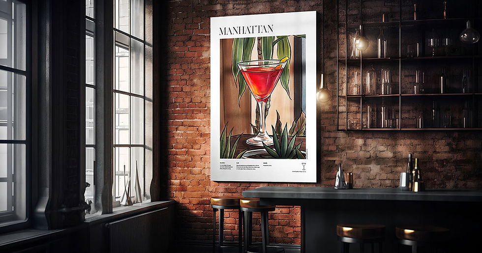
On 200gsm premium art paper with a matte finish, illustrated art looks as it was meant to look. The colours are vivid without being garish. The blacks are deep and consistent. The fine detail — the cast list at the bottom of a film poster, the recipe text on a cocktail print, the coordinate detail on a city poster — is sharp and legible at any size.
This is not an abstract quality claim. It is the practical difference between a print that looks good in a product photo and a print that looks good on your wall for five years.
How to Spot a Quality Print Before You Buy
Buying art prints online requires trust. You cannot hold the paper before you buy. Here is what to look for.
Paper Weight Specified
Any printer confident in their paper stock will tell you what it is. If a product description does not mention GSM, that is a red flag. Quality printers lead with this detail. Budget printers often bury it or omit it entirely.
Matte Finish Stated
Gloss finishes are often presented as premium. They are not. A matte art paper finish is the mark of a printer who is making considered choices rather than defaulting to the most visually impressive showroom option.
Print on Demand vs Warehouse Stock
Prints that have been sitting in a warehouse have been affected by temperature variations, humidity, and compression from stacking. Print-on-demand means your print is fresh. It has never been rolled and unrolled, never been compressed, and never been stored next to something damp.
Return Policy as Quality Signal
Printers who are confident in their quality offer meaningful return policies. If a print arrives damaged, they replace it. If the quality does not match the description, they make it right. The absence of a clear return policy is often a sign that the seller knows the product will not always arrive in the condition shown.
Why We Print to Order
Every Poster Shop Boys print is produced when you order it. We do not hold warehouse stock. We do not print batches and store them waiting for buyers. When you place an order, we print it.
This means there is a production time before dispatch — three to five working days. We know this is longer than clicking buy and receiving a box the next morning. However, we believe it is worth the wait, and here is why.
A print produced specifically for your order is always fresh. The paper is not compressed from storage. The ink has not had time to shift. There is no risk of receiving a print that was stored incorrectly six months ago.
It also means every print is subject to a quality check before it leaves. In a high-volume warehouse fulfilment operation, individual quality control is practically impossible. When you are printing one order at a time, it is not only possible but obvious.
We understand that waiting three to five days is a trade-off. What you receive at the end of it is a print that was made for you, on fresh paper, checked before it was sent. That is a different product from a warehouse roll shipped the same day. Browse our collection at postershopboys.com

Comments