
The Home Bar Deserves Better Than a Novelty Sign: A Serious Look at Cocktail Wall Art
- Poster Shop Boys
- Jul 4
- 6 min read
Updated: 2 days ago

The home bar has had a complicated decade. It arrived quietly during lockdown as a practical necessity — somewhere to make a drink when the pub wasn't an option — and then it refused to leave. Millions of people in the UK now have a dedicated corner, shelf, or full cabinet given over to spirits, glassware, and the paraphernalia of amateur mixology. The question of what goes on the walls above it, though, has largely gone unanswered. Or rather, it's been answered badly.
The novelty sign market has been only too happy to fill the void. "The Bar Is Open." "Prosecco O'Clock." Some variant on a chalkboard font and a thinly amusing slogan that felt tired roughly three weeks after it was printed. These things exist. They sell. And they are, in the most polite possible terms, a total waste of a wall.
This is not an argument against fun. It's an argument for intention.
What the Novelty Sign Gets Fundamentally Wrong
The problem with most bar wall décor isn't that it's decorative — decoration is fine, decoration is good — it's that it makes no claim on you. It asks nothing. It offers a weak joke and then sits there, permanently, being weakly funny at exactly the same volume every single day until you stop seeing it entirely. That's not design. That's visual wallpaper.
Good wall art in any context — kitchen, living room, hallway, home bar — should do something. It should hold attention on first viewing and reward it on the fifth. It should reflect something real about the person who hung it there. A space dedicated to the craft of making drinks is actually one of the most promising canvases in a home precisely because it has a subject. It has specificity. The home bar is, more than almost any other room, about taste in the most literal sense.
And yet the standard response is to lean into cheap irony rather than genuine aesthetic ambition. Which is a shame, because the drinks themselves are extraordinary design subjects. A Negroni is not a casual thing. It has structure, proportion, history, and a colour that is frankly difficult to argue with. The question isn't whether cocktails deserve serious visual treatment. They absolutely do. The question is whether you can be bothered to find it.
Why Cocktails Make Exceptional Poster Subjects (When Cocktail Wall Art Done Properly)
Consider the Negroni for a moment. Equal parts Campari, gin, and sweet vermouth — a formula so perfectly balanced that it has essentially not changed since Camillo Negroni reputedly asked a Florentine bartender to strengthen his Americano sometime around 1919. That's over a hundred years of the same drink, served in the same glass, producing the same deep amber-red that photographers and art directors have been trying to capture ever since. The visual identity of the Negroni is inseparable from the drink itself. It's not decoration. It's the thing.
The same logic applies to the Old Fashioned — one of the oldest cocktail constructions in the record, built on the idea that whiskey is already good and the job of everything else is not to ruin it. Or the Dry Martini, which is less a drink than a philosophical position. These cocktails carry weight. They have advocates and arguments and deeply held opinions attached to them. A well-executed cocktail recipe poster in the UK that takes the Martini seriously is doing something culturally honest in a way that a "Gin O'Clock" sign simply isn't.
The illustration approach matters enormously here. A cocktail reduced to a flat vector icon tells you nothing. But a poster that commits — that renders the geometry of the glass with intention, uses colour the way the drink uses colour, and treats the recipe as design information rather than filler — that's a different object entirely. That's something worth looking at while your drink opens up.
The Difference Between a Recipe Poster and a Reference Card
There's a version of the cocktail recipe poster that exists purely as function: a laminated card behind the bar, a typewritten list of ratios, a Notion doc on someone's phone. Useful. Not interesting. The recipe poster that earns a place on the wall has to resolve a genuine design tension: it must be informative enough to justify the recipe format, and beautiful enough to justify the frame.
This is harder than it sounds. The temptation, when you've decided to include recipe information, is to let the text do all the work. Ingredients listed. Method noted. Done. But a poster structured around the recipe as its visual spine — where the proportions of the drink inform the proportions of the layout, where the colour palette comes directly from what's in the glass — is doing something more sophisticated. It's collapsing the distinction between the subject and its representation.
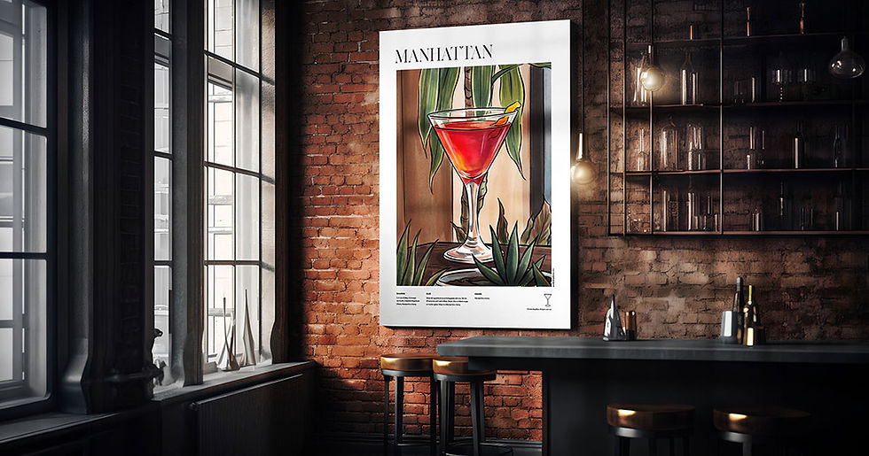
A Whiskey Sour poster that uses the specific golden-amber of a well-made sour as its dominant tone isn't just illustrating a drink. It's making you feel something about the drink before you've read a single word. A Manhattan poster that gets the deep mahogany right, that treats the cherry as a genuine compositional element rather than a garnish afterthought — that's visual thinking. A cocktail recipe poster worth putting on a UK home bar wall should pass one simple test: would someone who doesn't drink this cocktail still want to look at it? If the answer is yes, the design has done its job.
How to Actually Hang a Home Bar Wall Without Getting It Wrong
The home bar presents a specific set of hanging challenges that living room gallery walls don't. The space is often compact. The background is frequently dark — dark shelving, dark bottles, dark glassware. And there's a density of objects already competing for attention. A poster that might sing on a white wall can completely disappear behind a row of backlit spirits.
Contrast is your first consideration. A pale, high-key illustration with strong linework will read more clearly in a bar context than something dark and atmospheric, which can vanish entirely into the surrounding clutter. The Aperol Spritz, with its aggressive orange, is practically purpose-built for this situation. The Gimlet's clean green against white offers a similar clarity. If your bar is already a collision of amber and brown — which most are — lean into the drinks that break the palette rather than echo it.
Scale matters in a different way here too. A home bar doesn't usually have room for an oversized statement piece. A40–50cm print in a simple, unfussy frame tends to work better than something that tries to dominate a small space. Two or three prints hung as a loose grouping — a Negroni, an Old Fashioned, a Dry Martini — functions more like a curated spirits shelf than a random selection of wall art. Which is exactly what it should be.
The Mojito Problem, and What It Reveals About Taste
Here's the sharp edge of this argument: not every cocktail deserves equal treatment, and your poster choices will communicate something about what you actually know about drinking. The Mojito is a fine drink, refreshing and well-constructed, but it's also the most ordered cocktail by volume in British bars and is often the first thing someone makes when they buy a cocktail shaker and a bag of mint. Hanging a Mojito poster in your home bar isn't wrong. But if it's the only thing you hang, it says something.
This isn't cocktail snobbery — it's the same principle that applies to any collection. A film lover's wall that contains only the most commercially recognisable films tells you less about them than one that includes something unexpected alongside the blockbusters. The home bar wall is a curation exercise, and curation requires a point of view. The Sidecar is one of the most elegant constructions in the cocktail canon — a Cognac-based drink that dates to the 1920s, perfectly proportioned, visually stunning, and virtually unknown to anyone who hasn't actually sought it out. A Sidecar cocktail recipe poster on a UK home bar wall tells a more interesting story than twelve Aperol Spritz signs. Both are valid. Only one is a taste statement.
The Long Island Iced Tea, for what it's worth, is included in our collection. No judgement. It is what it is. It will also look genuinely excellent on a wall, and that's the whole argument in miniature: done with care, even the most democratic drink can hold its own as design.
Browse the Collection
If your home bar wall currently says nothing worth saying, our Iconic Cocktails range is the place to start — illustrated recipe posters for the Negroni, Old Fashioned, Dry Martini, Manhattan, Gimlet, Sidecar, Mojito, Whiskey Sour, Aperol Spritz and Long Island Iced Tea, each designed to earn the frame rather than just fill it.

Comments