The Films Worth Hanging On Your Wall — And How To Do It.
- Poster Shop Boys
- May 5
- 7 min read
The definitive guide to illustrated movie posters — for the film lover who takes their walls as seriously as their watchlist.
There is a specific kind of film lover who has watched Pulp Fiction six times, can describe every scene in The Shawshank Redemption from memory, and still has nothing on their walls except a calendar and a mirror. This is for them.
Choosing a movie poster is not like choosing a print of the Eiffel Tower or a botanical illustration. It is a declaration. It says: I have seen this film. This film meant something to me. I want it to be the first thing I see in the morning and the last thing I see at night.
That is a lot of pressure to put on a rectangle of paper. So here is a guide to making the right choice.
Why Illustrated Rather Than a Film Still?
This is always the first question and it is worth answering properly.
A film still is a photograph taken on set. It is technically what happened. An illustrated movie poster is an interpretation — an artist's understanding of what the film means, which scenes define it, which characters carry it, which visual language captures it. The difference is enormous.
The best illustrated movie posters do not just show you what a film looks like. They show you what a film feels like. The composition, the colour choices, the typography — all of it communicates mood in a way a photograph cannot.
There is also a purely practical consideration. A film still is a reproduction of something that already exists. An illustrated poster is original art. When someone walks into your room and sees an illustrated Pulp Fiction poster, they are looking at a piece of work that someone made. That has a different value — aesthetically and conversationally. The Films That Make Great Posters — And Why
Pulp Fiction (1994) — Quentin Tarantino
There is a reason Pulp Fiction is probably the most illustrated film in poster history. The characters are visually iconic — Mia Wallace at the diner, Jules Winnfield delivering the speech, Vincent Vega in his black suit. The film has a visual language that is immediately recognisable and endlessly reinterpretable.
What makes a Pulp Fiction poster work is specificity. The best illustrations choose a single moment — Mia with her cigarette, the milkshake, the overdose — and commit to it completely. The films that make great illustrated posters are almost always the ones with iconic single frames rather than sprawling ensemble scenes.
If you love Tarantino and you want one poster, the Mia Wallace diner scene is the one. It is the most iconic image in modern cinema and it looks extraordinary on a wall.


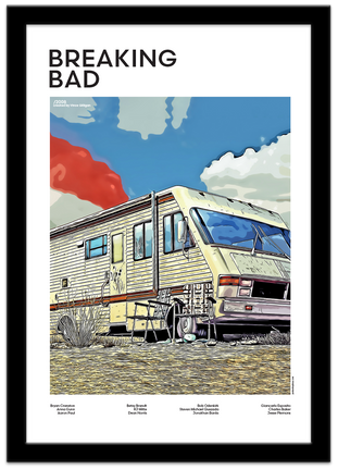
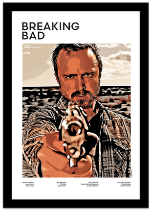
Breaking Bad (2008) — Vince Gilliga
Television earns its place on the wall when it reaches the quality of cinema. Breaking Bad long since earned that right. Walter White's transformation from chemistry teacher to drug kingpin is one of the great character arcs in storytelling — and it produces extraordinary illustrative material.
Walter White folded over a table, contemplating consequences he has not yet understood. Jesse Pinkman gun in hand, consequences that have fully arrived. The RV in the New Mexico desert, before either of them understood what was coming. Three posters, three moments, one extraordinary story.
The Breaking Bad poster works best for people who have actually finished the series. It hits differently when you know what happens.


Fight Club (1999) — David Fincher
Fight Club is the film that makes people want to recommend it to everyone immediately and then regret doing so. Tyler Durden is one of the great cinematic characters — charismatic, dangerous, philosophically interesting in ways that reward repeat viewing.
The illustrated approach suits Fight Club particularly well because the film itself is so visually stylised. Dark palettes, high contrast, faces that carry tension. An illustrated Fight Club poster captures the mood of the film rather than just the plot.
The Marla Singer portrait is an underrated choice. She is the emotional core of a film that spends most of its time pretending she is not.


The Shawshank Redemption (1994) — Frank Darabont
Shawshank is the film everyone cries at and nobody admits to crying at. It is also one of the most consistently beloved films ever made — number one on the IMDb top 250 for most of its existence.
What makes it work as a poster is the relationship between the two characters. Red and Andy are one of cinema's great friendships, and any illustrated poster that captures the dynamic between them — the hope that one carries and the experience that the other has accumulated — tells the whole story in a single image.
The tunnel framing in our version is one of the most compositionally interesting choices in the collection. Looking through the hole in the wall to see Red, the warden and a guard — it is a clever visual summary of the entire film.


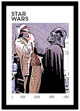
Star Wars (1977) — George Lucas
Star Wars is a special case because the fan base is so large and so devoted that almost any illustrated version of the characters will find an audience. But the best Star Wars posters make choices — they do not try to include everything.
Han Solo and Chewbacca works because the relationship between them is the beating heart of the original trilogy. The Darth Vader and Rebel scene works because it is the moment that defines the entire Star Wars mythology. Luke and Leia works because of what the audience knows that the characters do not.
The Yoda illustration is the most meditative choice in the collection. It is the poster for people who have thought about the films rather than just enjoyed them.


The Films That Are Harder To Illustrate
Not every great film makes a great poster. This is worth knowing before you commission a custom piece or look for something specific.
Films that work primarily through performance — long scenes of actors talking, subtle emotional shifts, naturalistic lighting — are genuinely difficult to translate into illustrated art. The magic of those films is in the viewing, not the framing. A still or illustration captures the surface rather than the feeling.
Films with very specific colour palettes sometimes struggle too. The particular grey-green of a Fincher film or the washed-out California palette of a Paul Thomas Anderson production can be hard to capture in illustration without either losing the mood or producing something that looks like a graphic novel version of a completely different film.
This is not a reason to avoid these films. It is a reason to be thoughtful about which scene and which character you choose, and to trust an illustrator who has actually engaged with the source material.
How To Choose Which Scene
Most films worth illustrating have one scene that defines them and several that are memorable. The choice of which to illustrate matters more than people realise.
Choose the scene that makes you feel the whole film: The best illustrated posters are synecdoche — a part that stands in for the whole. Mia Wallace at the diner is not just one scene from Pulp Fiction. It is Pulp Fiction. The look, the attitude, the danger underneath the surface. That is what you want.
Avoid the most obvious moment: The most famous scene is not always the best poster. The most famous moment from Jurassic Park is the T-Rex attack. The best Jurassic Park poster in our collection is the children and Dr Grant hiding behind a fallen tree as a dinosaur passes overhead. It is specific, tense, and says more about the film's emotional register than the famous T-Rex shot.
Think about what the character means, not what they do: A good illustrated movie poster is a character study as much as a scene depiction. What does this person mean? What do they represent? The illustration should answer those questions visually.
Consider the composition: Some scenes are compositionally perfect for a poster. Others need significant creative interpretation to work at poster scale. The scenes that tend to work best are the ones with strong visual hierarchy — a clear focal point, a sense of depth, a relationship between foreground and background that tells a story.
Building a Film Poster Collection
The most interesting walls are not one great piece — they are collections that tell a story about the person who chose them.
If you are building a film collection rather than choosing a single poster, think about what the collection says together. Three Tarantino films — Pulp Fiction, Kill Bill, Inglourious Basterds — says something specific about your taste. Three different directors from the same era says something different. A mix of films from different decades and genres says something else again.
The most thoughtful film walls are the ones where you can look at each poster and understand not just what the film is but what the viewer thinks about it. That requires choices — choosing which film, which scene, which character, which moment. Those choices are the biography.
Start with one film you love unconditionally. The one you would watch on any night in any mood. Get that one right and build from there.
One Last Thing
The worst film poster choice is the one you made to be safe. The poster of a film you quite like because you thought it was a reasonable choice. The one that is fine.
Fine is the enemy of interesting. Your walls should not be fine.
Choose the film that embarrasses you slightly to love as much as you do. The one you have watched too many times. The one you would not admit to in certain company. That is the one that belongs on your wall.
Because that is the one that is actually true.

Comments